Written on 4/12/2014 in Web development
Well, here I am with post #3. Today I will be writing about my first stage of actual development. I started out looking up some blog frameworks and was not disappointed with the results. There are a lot of options for easily setting up blog websites, or websites where you can just blog without having to set up your own website. I was surprised of how customizable some of these frameworks were, providing a lot of easy-to-use freedom. However, easy is not an option and I'm doing this to learn and gain experience in developing an entire website from the ground up. So frameworking at this level is not an option. Custom development is just an offer I can't refuse.
Brainstorming
Start with the obvious: brainstorming and wireframing layouts. For this, I started out thinking about which devices I want to support. Desktops, laptops, tablets, phones, fridges, ... are all possible current and future devices that will access The Vorpal blog. Internet explorer, firefox, chrome, safari and opera are the main browsers at the moment. My opinion on cross-platform and cross-device development is that it should always remain a simple and clean solution. Unless a customer explicitly demands certain functionality or a certain experience across devices. I find it reasonable to set the limits at supporting as much devices as possible, with an as general solution as possible.
A recent meetup of a web development group within my company hosted a presentation about responsive webdesign. While I was already familiar with a lot of the tips and tricks that came up, I also learned a few neat new tricks. The presenter was also a firm evangelist of user experience(UX) and I agree with his opinion. UX makes the difference between a functioning product and an amazing piece of equipment that is easy and straightforward to use. The Vorpal blog is a great opportunity for a web playground and trying new things. So although lacking experience in the matter, which reminds me I should actually get some books about it, it would definitely get some extra attention in the early stages.
UX
I did watch a very interesting video introducing some concepts about UX in a general point of view. Design revolved around UX has been around forever, being used in a wide variety of products. Cars, air planes, metro- and train stations, operating systems, telephones, farming, ... In fact, I can't even think of a field where there hasn't been someone that though about the user experience of its products. This is also quite obvious, you need to attract customers, so you try to make a good, functioning product. But while this is enough for simply, some thought about UX being present. There are products showing that you need to maintain a certain mindset throughout the process of UX design to really make a product stand out. And just sometimes, this leads to amazing products that withstand the test of time. F.E.: Volkswagen Beetle - Apple iPod - Vespa - AK-47 - Post-its. The video is general to say the least and explains design principles independent of any field.
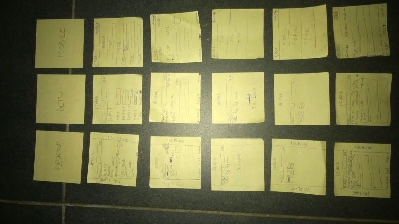
But enough jibber-jabber. Post-its are great, they are easy to store because they're small, they can catch attention because they're sticky and yellow and they are abundant on the work place and at home. So I use them to sketch, a lot. I find that they allow a certain sense of freedom, where you might generally use a whiteboard. Except, a whiteboard is out in the open and might attract unwanted opinions of bystanders. So I used post-its to sketch some layouts, I didn't come up with anything fancy but at least tried to think out of the box. My educated guess was that it would probably be smart to start out very simple and add sparkles later. The Vorpal blog will be available to different screen sizes by responsive design. I'm planning to architect the application in a way that I can expand easily into apps in the future. Three screen sizes are held into account:
- Narrow (mobile, but it's not mobile if it's on a desktop is it? || < 350 px)
- Narrowide (because making up words is fun, between narrow and wide || 350-750px)
- Wide (desktop, but it's not desktop if it's not a mobile is it? || > 750px)
I started with the 'wide' version because there was no overview of the data that will be presented as yet and I find it easier to restructure data starting top down. You can also go bottom up, where you start with the lower resolutions and work your way up. And I guess it's a matter of preference. But I find it to be a good guideline to start with the most important resolution for your specific application.
Early development
Choice of technology at this phase was quite simple. Html(5) & Css(3) will make up for the structure and layout of my pages. Early development was in Notepad++ and tested on Opera. Opera is my favourite browser at the moment because it's clean and I'm reluctant to clean out my chrome install. It's also equally fast and supports chrome extensions if necessary. An extension I found in this phase to be incredibly handy was 'Layers'. All it does is replace/set background-colours of all elements with semi-transparent black. This effectively shows you a geographic top-side map view of your website and makes it easy to identify overlapping div problems.I also used the default user agent switchers and responsive design helpers to resize my window. Anyhow, here are the results of the first layout:
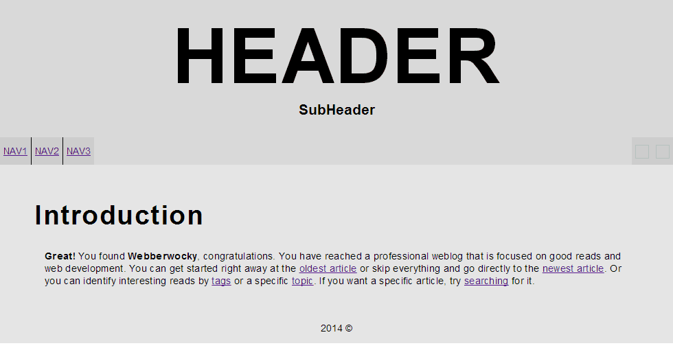
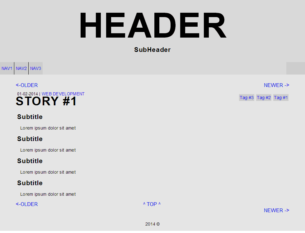
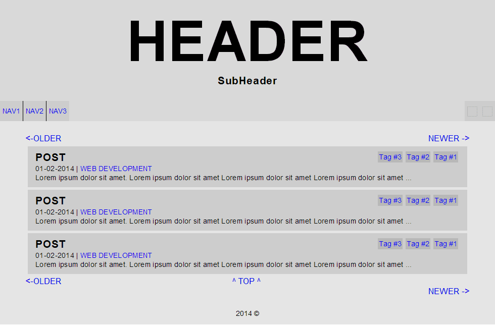
I like to use grey's when doing the layout, I find that colours distract a lot. Also, structure should be separated from the styles. In the future The Vorpal blog might support some theming and this is easier when the structure is independent. As I ranted on about earlier in this post, I tried to work with UX design in mind. At this stage, what I thought about was mainly positioning. Main information on the center of the screen. I tried to group relevant information together as you see in the 'Post' view. The exact same layout and logic for the previous, next and top buttons on all pages should be kept so the user quickly recognizes these navigation buttons. I tried to keep the tags always on the right side, except in the tag view itself. They should always be shown in the same layout as well for easier identification. That was about all I could think of in a small website like The Vorpal blog.
![Layouts][layouts]
Anyway, that's it for this post, return in a few days for the next post!