Written on 10/1/2014 in Web development
Are you seeing a grey background behind the title? Are you not seeing the colourful blocks? Well, the vorpal blog has been redesigned! Why? Because the old look was already 6 months old! Well, actually, I found the older design to be quite daunting. This was - like previously mentioned - because I coded while designing. Making it very hard to keep design and UX separate from laziness.
Another reason is that I wanted it to be 'simpler'. I used a lot of tricks to get the previous version looking the way it did. I positioned some elements using relative and absolute positioning, floats, ..., which made the website a bit too complicated. The new version also has a new homepage, nothing big, but I believe it's more welcoming, and clearer for visitors that are not looking for the blog. Refactoring happened in 5 steps.
- Data approach
- Redesign the blog
- Create / design the new homepage
- Work out the new site structure
- Publish / deploy
Data approach
In my previous post I already mentioned I wanted to go Angular. I was hoping to reduce response times and making everything a little bit more interactive. I also mentioned that I came back on that decision because of SEO. So there will be no other way of approaching data YET. I'm looking for alternatives, using AngularJS and PhantomJS for prerendering pages. But I'm skipping this part for now.
Redesign the blog
Second on the list was the redesign of the vorpal blog. I started out in OneNote. I more recently acquired a Surface Pro 3 and I've been using it a lot. It comes with a stylus, this makes it a lot easier to draw, edit and share layouts. I sketched and tried out some layouts in OneNote. I try to be experimental, think outside the box, but I believe that on a blog, simplicity is key.
Looking at recent developments, blogs are going very minimalistic, and I dig that, although sometimes it's a bridge too far. There are a lot of reasons to go minimalistic, but the most important reason should be to keep the focus on the content. So as long as the design doesn't move attention from the content to the design, we're OK.
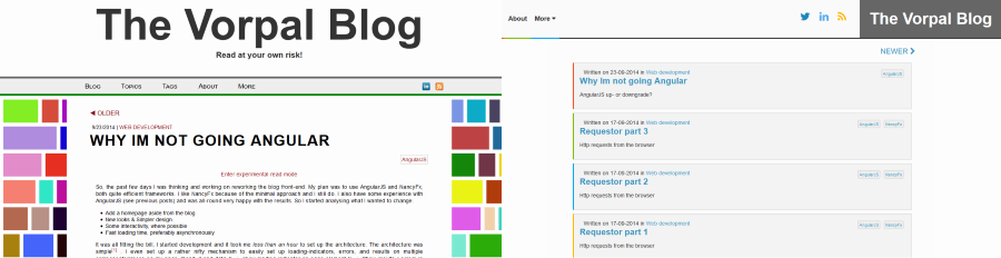
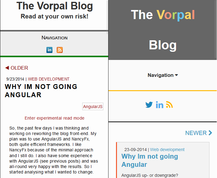
Colours can distract when used too much, so I'm only using them as accents. No more colourful blocks1. I did try to use the accents to make the page a bit more surprising and interactive without it being too much. Try hovering over the title. Now, isn't that wonderful? When you scroll down the page on a wide screen, the sidebars will also change colour very slowly. This creates a mood.2
I do regret to say that these small bits of fun, are not for mobile users. Mobile users have fewer non-actionable events to be used. For me, there are actionable events and non-actionable events.6
actionable
An example for an actionable event is a mouse-click or a touch. This implies that something should happen3. An action should be executed. When nothing happens after clicking/touching a button or a link, the user will most likely assume it is a bug. Another example of an actionable event is dragging-dropping. This works on defined areas, mostly defined by UX so the user recognizes where he can click, drag, and drop.
Non-actionable
An example for a non-actionable event is hovering with your mouse over an element. Nothing has to happen. Updating an entry in the database when you hover over something should be considered 'strange'. Meaning that it's a great opportunity to provide extra feedback or information. When a button is hovered, you make sure the button changes a bit. That way, the user knows he can click it and some action is possible. Another example are the tool-tips that show when hovering over this4. Another example is the 'scroll' event.
Mobile lacks a few of these non-actionable events. A touch-screen has no hover event5. A mobile screen also has fewer space for playing around with stuff.
My absolute favourite event is 'hover'. It's so great, it even sounds majestic.
Touch-screens are robbing me of this, and that makes me very sad. But since most of these interactions add nothing to the content, it doesn't really matter.
Moving on
I'm following the same approach throughout the rest of the blog. Using light-greys and add colour by using accents. I changed almost nothing in the HTML. Perhaps I did something right the first time there. Since HTML is structural, and shouldn't be about layout.
Other changes are:
- Added font-awesome for icons
- Simplified responsive design
- Less JavaScript (The colourwall used a lot of JavaScript code)
- Changed navigation a little bit (Blog home is now the list of posts instead of the last post)
- Added fixed navigation buttons for next - previous and top on posts for wide screens
- Larger font on smaller screens
- Bigger buttons / Links for navigation on smaller screens
Create / design the new homepage
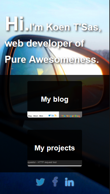
On the root domain path I wanted to provide some kind of portal. Easy on the eyes and a small amount of panache. Photos can do that easily. All you have to do is find an appealing photo, preferably with people smiling on it and you're done. I did not have a photo like that lying around. But I did have a picture of my car's mirror with the sunset in it.
So I just slammed the photo on the background, broke out the css hacks to hack together some styles and transitions. Topped it off with using flexbox, for easier positioning. This made sure the home page isn't visited by old browsers, mua, ha, ha. There really is nothing more to it.

Work out the new site structure
Without the home page I had the following structure:
- Nothing
-- Blog
-- Manage
-- All other subsites
In the file system this looked like this:
site\wwwroot => Blog MVC application
site\wwwroot\Manage => Manage Web api application
site\wwwroot\otherSubSites => MVC, NancyFx, HTML pages, regular virtual directory behaviour
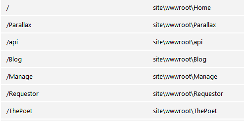
The new structure should look like this:
- Homepage
-- Blog
-- Manage
-- All other subsites
Easy enough, if it wasn't for that meddling IIS and a poorly thought-through8 previous structure.
Publish / deploy
The root of my application was an MVC website. - In the blog MVC application, I'm software-redirecting users from '/' to '/Blog'. - Because of this, I had to make a few changes to the MVC application and move it into a virtual directory. I wanted the file system to look like this:
site\wwwroot\Home => NancyFx homepage
site\wwwroot\Blog => Blog MVC application
site\wwwroot\Manage => Manage Web api application
site\wwwroot\otherSubSites => MVC, NancyFx, HTML pages, regular virtual directory behaviour
For getting to this file structure I had to add virtual directories in the azure portal. The end result looked like this:
Then I started publishing the homepage application. I changed the publish settings accordingly7 and published. No problems. I did the same for the Blog MVC application. This gave the following error:
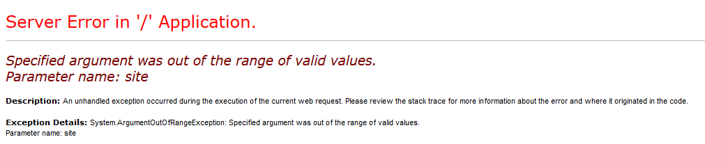
Server Error in '/' Application.
I was guessing this had to do with the fact that I was using MVC as a subsite in a NancyFx application. Most of the time, it's the other way around. After some troubleshooting, I found out this had to do with the web.config file. More precisely, the inherited http-handler NancyFx uses to handle requests. I added the following to the web.config in my MVC and Web Api project(s):
<system.webServer>
    ...
    <handlers>
        <remove name="Nancy" />
    </handlers>
    ...
<system.webServer>
With this setting, the MVC and Web API websites started working again. Next up was publishing some NancyFx applications. ThePoet for example. These had problems too. There was no error returned. Upon closer inspection, the server returned a 500 status code, but an empty page. I knew this had to do with the NancyFx root website. So I checked the documentation and saw this little piece of awesomeness:
It might be me, but this is a very confusing piece of information. I was jumping around my site's web.configs for a good amount of time before I knew where I had to add the following code:
<location path="nancy">
  <system.web>
    <compilation debug="true" targetFramework="4.0" />
    <httpHandlers>
      <add verb="*" type="Nancy.Hosting.Aspnet.NancyHttpRequestHandler" path="*"/>
    </httpHandlers>
  </system.web>

  <system.webServer>
    <modules runAllManagedModulesForAllRequests="true"/>
    <validation validateIntegratedModeConfiguration="false"/>
    <handlers>
      <add name="Nancy" verb="*" type="Nancy.Hosting.Aspnet.NancyHttpRequestHandler" path="*"/>
    </handlers>
  </system.webServer>
</location>
This piece of code goes into the subsite's web.config. Note that 'path="nancy"' means that your subsite will be in '/nancy'. After I added the location tags, the website worked after publishing. Everything was up and running.
Conclusion
To be honest. I wasn't expecting it to be this much work. I spent a good few hours looking for solutions, editing web.configs, undoing changes, commenting out code and going through some very obscure blogs. I think I spent only 25% of development time on redesigning the blog and creating the homepage. A part of the issue was probably my lack of knowledge and experience of working with the configuration files.
But for the most part, it was because I was too naïve. What was I thinking, everything going according to plan. What a silly blog post this would have been. Next on my todo list is adding a commenting system. Probably Disqus, so keep reading, so you can flame me all you want in the comments!